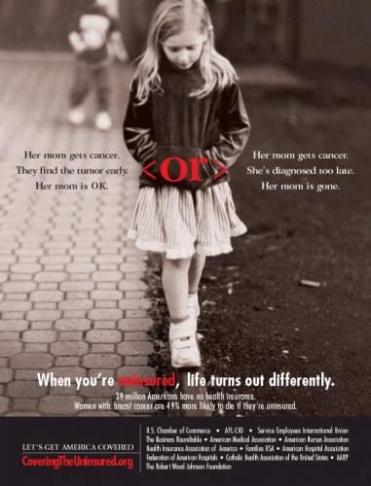
My first magazine advertisement is this ancient Cover the Uninsured Week advertisement from Time Magazine in 2008. One of the main reasons why I chose this advertisement to comment on first is that I am the little girl up there (crazy, right?) and second, because it was a very controversial advertisement during this time period for many reasons. With the number of Americans covered by health insurance in the years 2001-2005 significantly decreasing, Cover The Uninsured Week was put into place before the Obama Administration took over as a week every March to raise awareness and try to “get America covered.” With all bias aside, I like this advertisement because for the first time, “covering the uninsured” wasn’t all about the parents but it focused on the consequences that effect your loved ones, children especially. This advertisement sparked much discussion among National News personnel stating that it was the first time that America could finally “uncover the uninsured” and see what was happening as a consequence of the rising cost of healthcare. The main component of the ad that sticks out to me is the formatting. The main focus is on the more powerful and emotional words at the forefront of the advertisement, whereas the statistics and sponsors are smaller and out of focus. This advertisement focused on “the bigger picture,” and with the Television and print ads being so similar, more people could relate because it became a national symbol for those who followed the progress of the Healthcare issues of this time period.
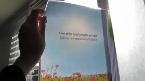
My next print ad is the Shikun and Binui Solaria magazine ad. This print ad promoted green energy by being solar-powered itself. In the magazine, it’s just a black-and-white sketch. But held up to sunlight, it blossoms into full color. This ad happens to be one of the most interesting ads I’ve ever seen, making it more memorable for the reader because it is interactive and something that most people wouldn’t expect from a magazine. Taking into account where most people read magazines now, doctor’s offices or simply to pass the time, this ad is something that can keep the reader’s attention and may even travel by word-of-mouth making it a very successful advertisement.
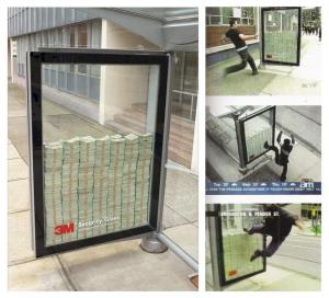
In my opinion, this outdoor advertisement for 3M’s Security glass is by far one of the most interesting advertisements ever created. The idea behind this “advertisement” at a bus stop is that if you can break the glass, you get to keep the money in side. Here, in the photo above, you see people doing everything they can to get to the money. This is an interactive and simple approach to advertising something we, as consumers, don’t normally see advertised. What better way to say “this glass is tough” than by letting the consumer see for themselves?
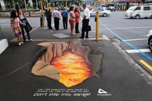
Lastly, I’d like to say I love everything about this advertisement to raise awareness about pedestrian safety by Auckland City Council in 2013. I think the most interesting part of this advertisement is that it uses the actual “danger” as an advertisement in itself. This was a very clever way to raise awareness for pedestrians and the hazards on the road. Although the artwork portrays a large hole with what appears to be lava or another “dangerous” substance, the passersby are left with the statistic of fatalities on the road making it a reality that the road itself is actually more dangerous than any “lava-filled hole.” This implication is strong and it will stick in the minds of those who see it, making it a subtle, yet successful Public Service announcement.


